Using targets in tiles
Once sales targets are set up for your company, teams, or individual users, you can add those targets to dashboard tiles. This lets you compare actual sales with targets directly in visual charts like gauges, bar charts, and big numbers.
To learn how dashboards and selections can help you monitor and forecast sales, see Forecast your sales.

Add tile with sales targets to dashboard
Open the Dashboard screen.
Select the dashboard you want to edit.
Click and select Edit dashboard tiles. On the right side of the selected dashboard, the Edit dashboard tiles section is displayed.
In the Show tiles for list, select Sale.
In the Library tab, select one of the following charts:
- - Big number
- - Bar chart
- - Column chart
- - Gauge chart
- Empty sale tile
Tip
You can also select an empty tile to create a tile from scratch, but the chart type must be one of those listed above.
To add a tile to the dashboard, drag and drop it on the desired position on the dashboard. You can also click Add to add a tile to next available position. The tile will automatically adjust to the available space, and will align with the grid and columns setup.
Adjust the tiles on the dashboard:
Hold the mouse-pointer over a tile and click and drag the frame to adjust the tile size. Available slots/spaces in the dashboard are highlighted in yellow when the tile can fit in that position.
Click the header of a tile and drag it to another position.
In the dashboard, click the Edit tile icon () on the new tile.
In the Dataset tab, set Sale date to this year, quarter or month. Edit the other criteria as necessary. Remember to update the tile name to reflect any changes made here.
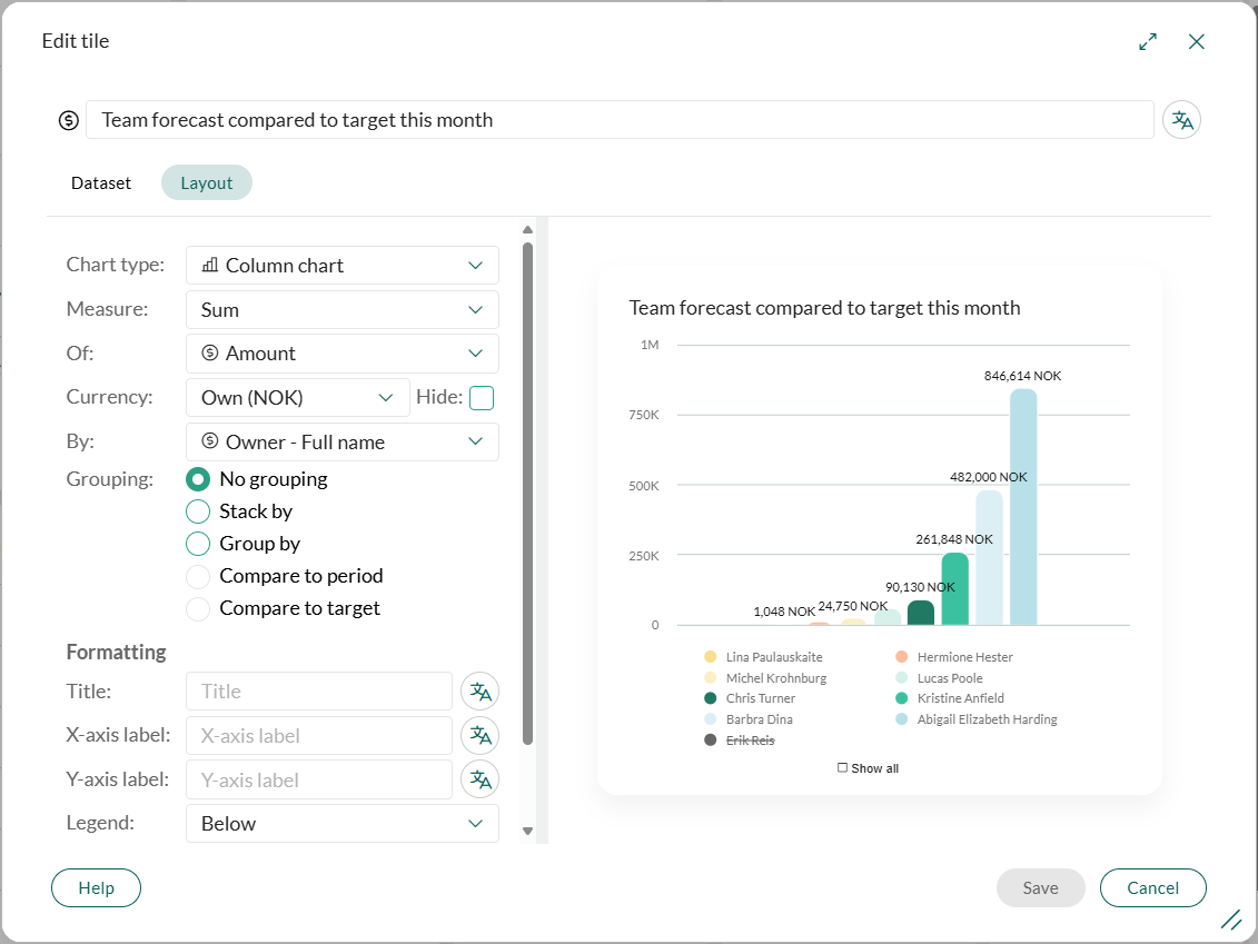
In the Layout tab, edit the layout:
- Chart type: Change this to any chart type listed in step 5.
- Measure: Select Sum or Count. For example, the sum of all sales or the total number (count) of all sales.
- Of: If you selected Count above, select Sale ID in this list. If you selected Sum, select Amount or Weighted amount.
- By: Select Sale > Owner (owner, full name or group) or Sale > Sale date. This option is relevant for bar charts and column charts only.
- Grouping or Footer: Select Compare to target.
- If this option is not visible or is inactive, double-check that you have completed the steps above. If you cannot select the option Compare to target (it is disabled), you can hover your mouse-pointer over the text. This will display a tooltip that explains what you need to change in order to enable and select the option.
- Target: Select the target you want to add to the tile. (Not relevant for bar charts.)
- Show as %: Select this option to show percentage of target instead of sums or counts. (Not relevant for column charts and big numbers.)
Edit the formatting. Based on the chart type you selected, you have additional options under Formatting:
- Big number: You can edit the colors used to display targets.
- Gauge chart: Use the option Mark target at to set the target on the gauge chart.
Click to add a translation to the tile name, titles and labels.
Click Save. Then click Done.
Why can't I select Compare to target?
If you see the field Compare to target, but it is disabled, you can hover your mouse over the field to see a tooltip that explains what you need to change to enable and select the field.
Is the Compare to target not visible at all, make sure that you have selected the correct chart type and you have used the Sales date as criteria in the Dataset tab.