Dashboard for leads
Note
This feature requires the CRM Suite Growth plan or higher.
Dashboards help you monitor lead volume, readiness, origin, and conversion trends. By combining tiles that show where leads come from, how they progress, and how they convert, you can evaluate the effectiveness of your marketing and sales activities.
Use this page as inspiration when you build dashboards for your organization.
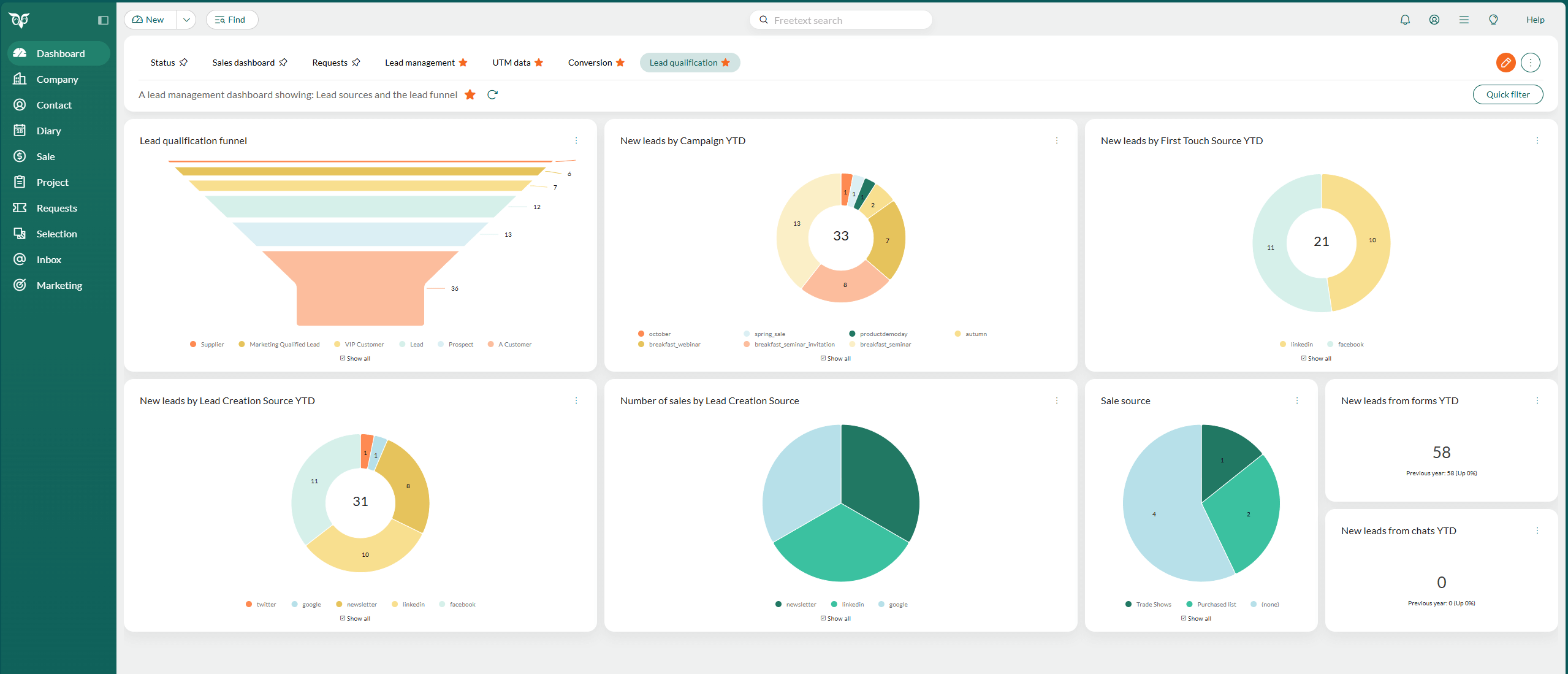
Example tiles for lead volume and progression
These tiles help you understand how many leads you receive, how they are distributed across statuses, and how they move through the qualification process.
Lead qualification funnel: Shows how leads progress from Open to Qualified. Use this tile to identify stages where leads are stuck.
New leads by campaign YTD: Displays how many leads each campaign has generated this year.
New leads by lead creation source YTD: Shows which channels generate the most new leads, such as web forms, social media, or newsletters.
New leads by first touch source YTD: Helps you understand the first interaction that triggered a lead.
New leads from chats YTD: Measures how many leads originate from chat conversations.
New leads from forms YTD: Shows the number of form submissions that resulted in new leads.
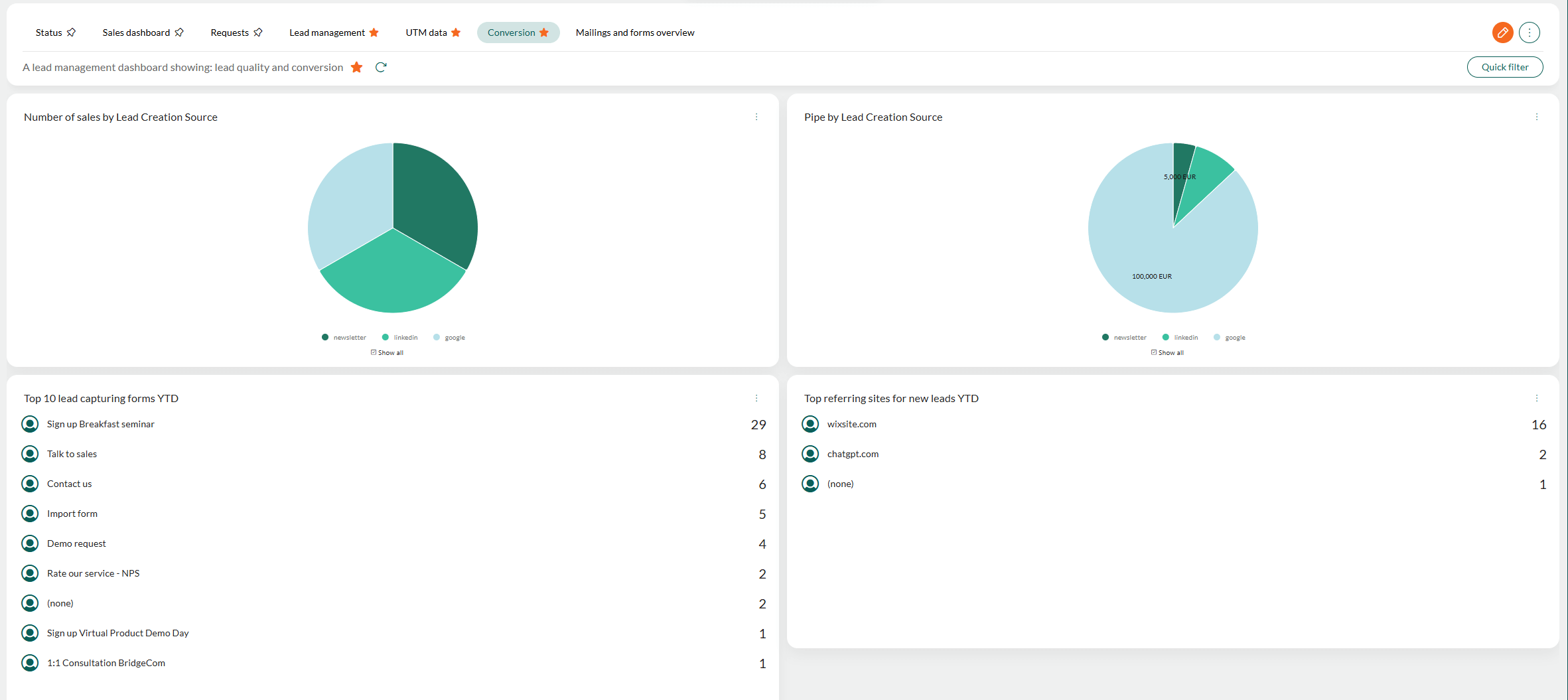
Example tiles for lead quality and conversion
These tiles highlight which sources generate qualified leads and which result in sales.
Number of sales by lead creation source: Shows which sources contribute most to actual sales.
Pipe by lead creation source: Displays the value of active opportunities linked to leads from different sources.
Top referring sites for new leads YTD: Lists the websites that send the most traffic that turns into new leads.
Top 10 lead capturing forms YTD: Shows which forms create the most leads across the year.
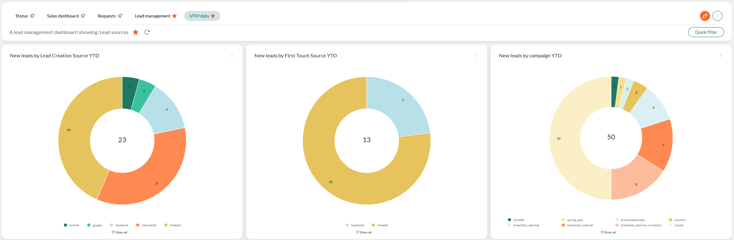
Example tiles for marketing handover
If you use UTM tracking (requires Marketing Premium or the Growth plan), additional tiles help you evaluate channel and campaign performance for lead acquisition.
New leads by lead creation source YTD: Shows which channels create new leads, such as Google, LinkedIn, Facebook, newsletters, or other tracked sources.
New leads by first touch source YTD: Highlights the very first interaction that turned an anonymous visitor into a lead. Useful for attribution and evaluating early-stage awareness channels.
New leads by campaign YTD: Displays which campaigns generated the most new leads this year, helping you compare campaign performance and identify high-converting activities.
Tips for building effective lead dashboards
- Combine status-based tiles and source tiles to understand both readiness and origin.
- Add filters (for example, by associate or country) to focus on the leads that matter most.
- Use dynamic selections as tiles when you need lists of leads instead of charts.
- Create different dashboards for marketing, lead nurturing, and sales, depending on their needs.