Display selection as a chart
After creating a selection, you can visualize your data using charts for a clearer and more immediate understanding. The available chart types depend on the selection type—for example, only sales-related charts are available for sales selections. Charts from dynamic selections can also be used in dashboards.
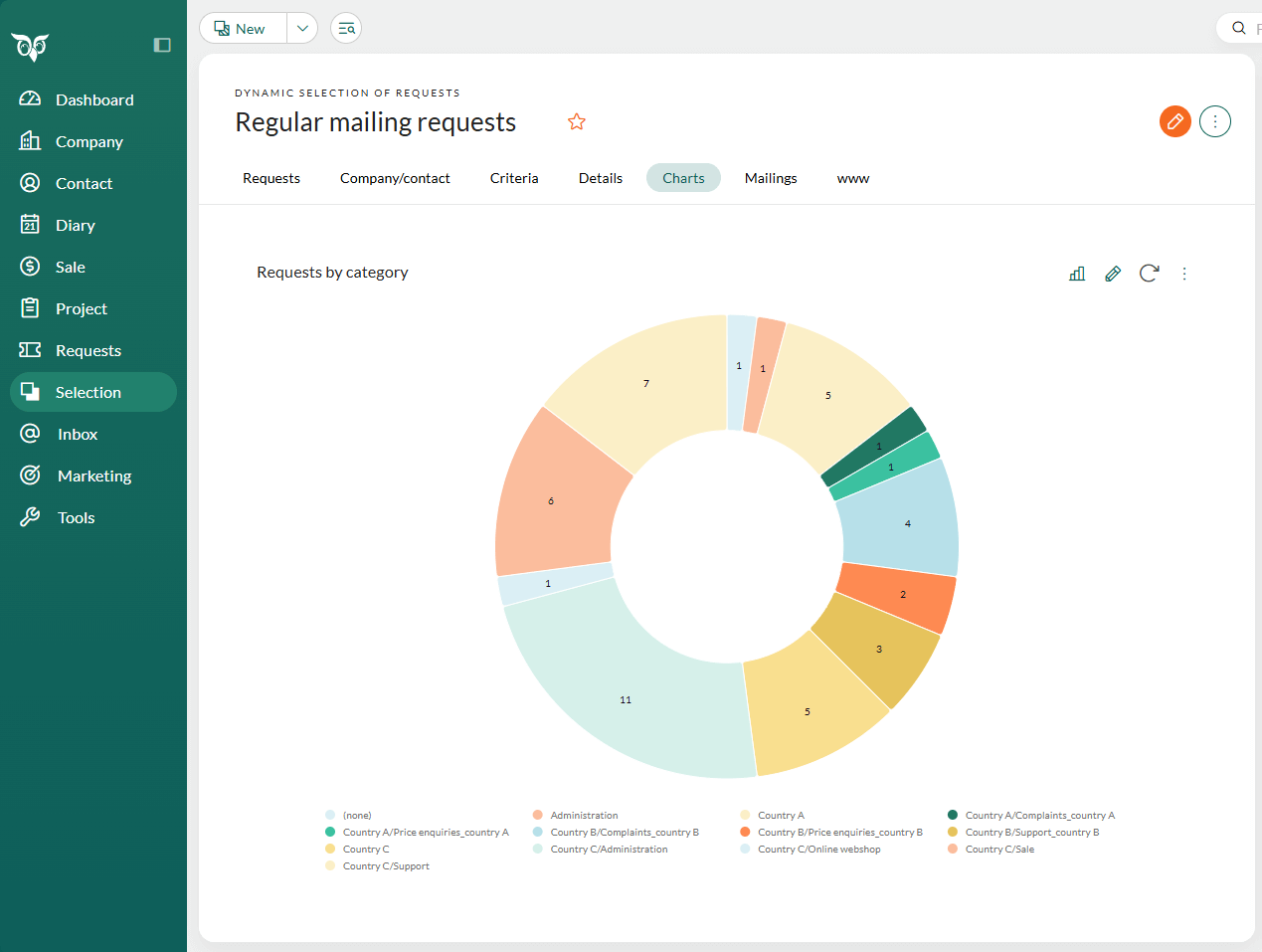
Steps to open a chart
Open the selection you wish to visualize.
Go to the Charts tab.
Click and select a chart type to display the data visually. The chart titles indicate what data will be shown.
(Optional) Click above the chart to open the settings panel, where you can configure the chart further.
Note
To see charts for all SuperOffice data (not just selections), select Dashboard in the Navigator.
Explore the chart
Click the data labels (legend) to hide or show specific values.
Hover over chart sections to see detailed source data.
Click a chart section to drill down into the data. Select a row to preview it.
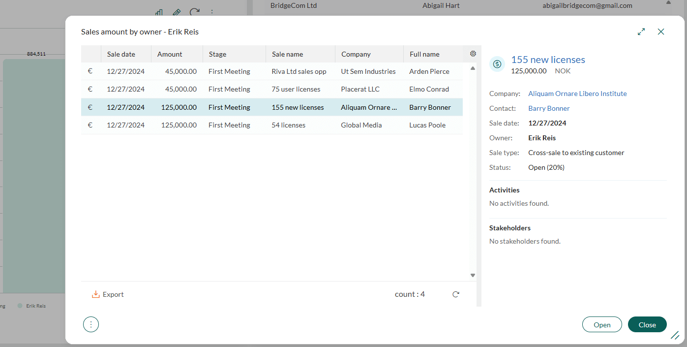
Click to update the chart with the latest data.
Click on the tab above the chart and select View in full screen to open a detailed view of the chart, including data tables and export options (PDF, PNG, SVG, CSV, and XLS).
Troubleshooting: No data available
If a chart displays a No data available message, it means your selection does not contain the necessary information. Try these solutions:
- Adjust the selection criteria.
- Choose a different chart type that aligns with your selection data.