Card config files
What appears inside the card element is the config data for the many views that a card can have. Let’s take the below config section from the card config file that was referenced in SoContactPanel, MiniCard.
<card id="MiniCard" placeholderid="rightpanel" type="SoTabbedCard" cardtype="MiniPanelCard">
  <views>
    <view id="MiniMonthView" type="SoView" soprotocol="minimonth" current="month" renderonlywhenselected="true">
      <caption>[SR_MINICARD_MONTH]</caption>
      <tooltip></tooltip>
      <controlgroups>
        <controlgroup id="mainminimonthgroup" type="SoControlGroup" position="absolute" left="0px " top="10px" bottom="5px" right="0px">
          <controls>
            <control id="minimonth" type="SoMonthCollection" width="100%" position="absolute"  top="0px" bottom="0px">
              <config>
                <onaftersplitterresize>CalendarManager.ResizeMiniMonth(\"{0}\")</onaftersplitterresize>
              </config>
            </control>
          </controls>
        </controlgroup>
      </controlgroups>
      <triggers>
        <trigger type="current">month</trigger>
        <trigger type="current">day</trigger>
        <trigger type="current">week</trigger>
        <trigger type="current">diaryowner</trigger>
      </triggers>
    </view>
  </views>
</card>
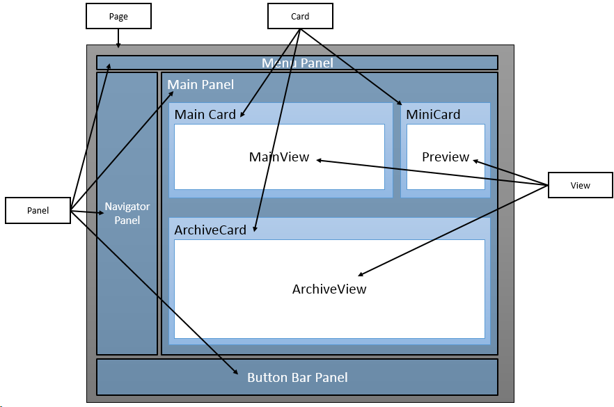
The outer element in the config file is card, just like the panel element was in the panel config file. This element holds the config data for the different views that can appear on a card.
A card configuration file defines the UI structure of a card and contains the layout of views in the card, which in turn contain controls.
Cards are placeholders inside panels and use layout positioning, and are responsible for invoking relevant data handlers for save and delete actions.
<!-- SoExampleCard.config -->
<card id="ExampleCard" type="Card"
       placeholderid="OnePanePlaceHolder"
       cardtype="SoTabbedCard">
  <views>
    <view />
  </views>
  <config>
    <datahandlers-to-save>
      <datahandler-reference>ExampleDataHandler</datahandler-reference>
    </datahandlers-to-save>
    <datahandlers-to-delete>
      <datahandler-reference>ExampleDataHandler</datahandler-reference>
    </datahandlers-to-delete>
    <keep-params-onsave />
    <customcssclass />
    <editmode />
  </config>
</card>
Different card types
| Name | Description |
|---|---|
| SoDialogCard | Used with DialogPanel. |
| SoDialogSimpleCard | Used with DialogPanel. |
| SoDiaryCard | Adds an associate chooser to the card. |
| FloatingCard | Not used |
| SoFindCard | |
| SoTabbedCard | Used to add tab container for views |
| SoWizardCard | As seen in MailMerge and Add todo task. |
Attributes
<card id="MiniCard" placeholderid="rightpanel" type="SoTabbedCard" cardtype="MiniPanelCard">
The above line explains the config for the card. It says the card ID is MiniCard and the place holder is the right panel. The placeholderid refers to the pane ID defined in the panel config.
The card type here tells us what the type of the card within the page is since there can be many types of cards within a page like the Archive card, the Mini card, and so on.
Views
Within the card comes the views element, which groups the config data for the views within a given card.
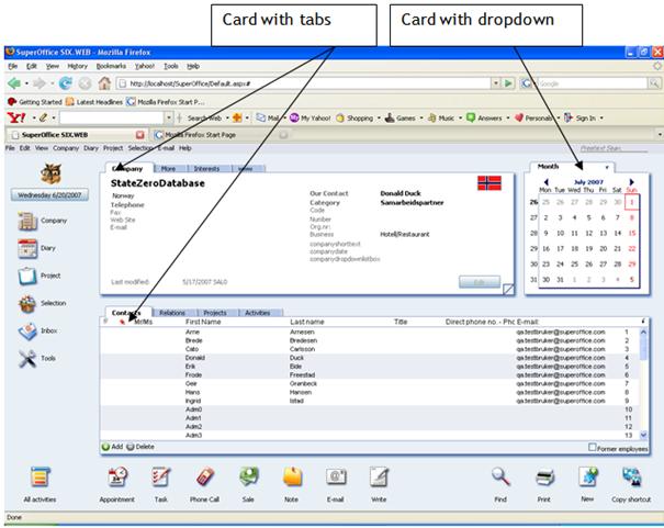
The views can be displayed one by one or all at once, this is decided by the implementation of the card. In SuperOffice, the card will display a tab control or a drop-down control telling the user which view is active and what other views are available.
You can use SoProtocol strings in the URL to force a switch to a particular view.
The config data for a view can appear in 2 ways: within the views tag or in a separate config file called a fragment
Next: view config files