Web client and the model-view-controller pattern
Many enterprise software applications base their application design on solid patterns that have been tried and proven true in high-demand environments. SuperOffice is no exception. From inception, the intent for the SuperOffice web client was to incorporate the most sensible patterns needed to build a rock-solid enterprise CRM application, yet remain flexible enough to facilitate a great deal of customizability. As the title states, it has accomplished this by leveraging an architectural design loosely based on the Model-View-Controller pattern. In this article, I walk you through the main aspects of the architecture and demonstrate how the different pieces fit together.
Figure One: How some people may understand MVC architecture before actually working with it.
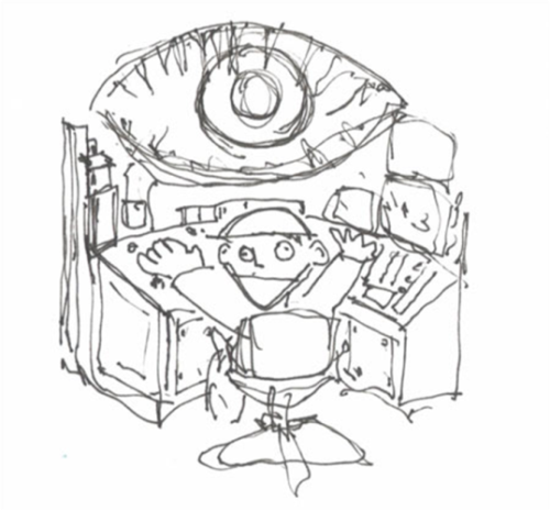
(Image courtesy of Describbles)
SuperOffice Web client
I remember my first few months working with the SuperOffice Web Client Expander Edition (SWCEE). In many ways, it was as confusing to me as the cartoon shown in Figure One. It took some time to piece together all of the decoupled components, there were many "ah-ha" moments, but it all slowly began to make sense.
Probably the biggest difference between the SuperOffice Web Client (SWC) and any other ASP.NET web application is that it creates a state-aware application in a stateless environment.
When compared to the windows client, which exposes a rigid "Current" system, the web client is driven mainly by a similar, but much more flexible, mechanism. Where the windows client is rigid and mute, the web client allows an organization to expand the current system and incorporate new "current"-states into the application.
Imagine for a moment that you’ve been tasked to build an integration that adds a new dialog to the application. In that new dialog, you are responsible for displaying product group information from an ERP system. As of this writing, there is no "currentproductgroup" current, but if interested in tracking what the current, or last viewed, product group is, then the system allows one to be created. This is a feature not available in the windows client.
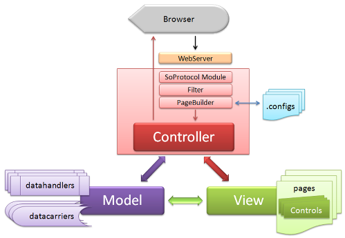
The current system is one of the fundamental pieces used to drive the application. Located in the Controller piece of the design, currents are important because requests to the web server often contain current values in the query string which the SoProtocol module then uses to re-define the current state of the application. The Model piece of this design relies heavily on this mechanism to decide what will finally be rendered to the view.
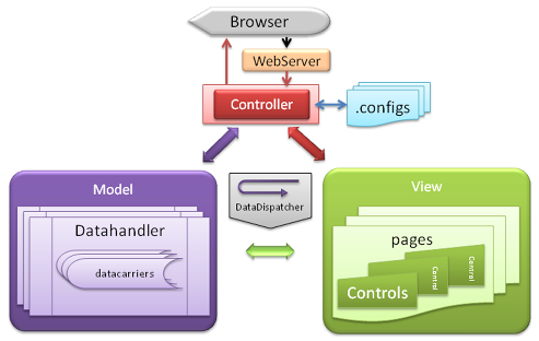
A simplified conceptual overview of the SuperOffice web client architecture:
Getting started
The general idea for this article is to demonstrate the fundamental concepts involved with the SuperOffice web client application design. I'll do this by building a new dialog, populating some controls in the dialog with data, and then demonstrate how to save the changes back to the database. I’ll discuss the different components that make up the architecture, seen in the above figure and attempt to show where and how each is used. I’ll discuss how they apply to the SuperOffice Web Client architecture, and introduce topics such as page configuration, built-in controls, custom controls, data handlers, and data carriers.
Page Configuration – the Inevitable View
There are configuration choices to consider when extending the web client. More specifically, a choice must be made that decides how the controls will be defined. The options are to completely define the layout using solely SuperOffice Markup Language (SOML) in the page configuration file or build custom controls that are then referenced in SOML.
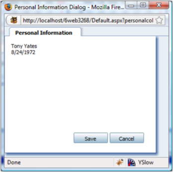
In the first part of this article, I will construct a simple dialog, shown in the figure below using just SOML. In the second part of this article, I will demonstrate how to accomplish a similar, but slightly more complex, page using a custom control. Demonstrating both options will allow you to see the similarities and differences in both scenarios.
A simple custom dialog:
The page configuration defines everything about a rendered view or web page. A page defines the title, data handlers, and controls displayed in the browser. Technically, a page configuration is not considered an MVC view until it has been parsed, transformed, and rendered as an ASP.NET page.
Whether just using built-in controls or referencing custom controls, the basic SOML configuration is similar. The following code shows an excerpt from the single view element used in the SoPersonalColorPage.config file. Do not confuse a view element here with an MVC view; they are not the same. A view element in SOML is a content placeholder for control groups and controls.
The framework will parse and use all the SOML on the page to construct the MVC view shown in the above figure. The view element in the code below declares one control group that contains two built-in controls: a SoTextBox and a SoDateSelector.
Defining control layout using pure markup:
<view id="PersonalColorExampleControl" type="SoDialogView" soprotocol="main">
  <caption>Personal Information</caption>
  <controlgroups>
    <controlgroup id="DateControlsControlGroup" type="SoControlGroup" top="10px" height="100%" width="100%" left="10px" right="0px" position="absolute">
      <controls>
        <control id="FullNameTextBox" type="SoTextBox" top="10px" height="25px" width="200px" left="10px" right="0px" position="absolute">
          <datasource>PersonalColorDataHandler.PersonalColorCarrier.Name</datasource>
          <config></config>
        </control>
        <control id="myDateTime" type="SoDateSelector" top="30px" height="25px" width="200px" left="10px" right="0px" position="absolute">
          <datasource>PersonalColorDataHandler.PersonalColorCarrier.BirthDate.Date</datasource>
          <config></config>
        </control>
      </controls>
    </controlgroup>
  </controlgroups>
</view>
If this is your first time viewing SOML, the above code might seem a little intimidating at first. Deconstructing each element will hopefully make things more readable.
Each element in SOML requires a unique ID. Except for the page element, the element id can be anything. The general guideline here is to make it relevant to the displayed information, or context.
Most SOML elements also require a type. Although not shown in the code, the card element that encapsulates this view element is declared as a SoTabbedCard type. The view is declared as the SoDialogView type. The result of having these types combined is visible in the view output, a card-looking tab with SuperOffice shading around the top, right, and bottom.
The sole purpose of the controlgroups element and controlgroup element is positioning. These elements are strictly containers that are used to position the controls they contain.
The controls inside a controlgroup element also have positioning attributes, but more important is the control child element: datasource. The datasource element defines what data the framework will bind to the control. I'll discuss data binding further very soon.
Once a page configuration has been created, the only way the framework can discover it is if it is declared in the SoApplicationConfiguration.config file. For example:
<page id="personalcolor" type="dialog" height="400px" width="400px" />
Any changes to SoApplicationConfiguration.config file will require an IIS reset to be recognized. This same philosophy also applies to SoObjectMapping.config.
Defining controls
One or more controls are defined within a controlgroup element. Control elements are used to declare built-in controls, such as SoLabel and SoTextBox. They may also contain references to custom controls, such as an ASP.NET User Control or Web Control. Before a custom control can be resolved and rendered in a page file, it must first be declared in SoObjectMapping.config first. For example, as seen in SoObjectMapping.config, a control is declared using the object element:
<object type="UserControl" mappingname="PersonalColorUserControl" assemblyname="ControlsAndDataHandlers" objectname="~/UserControls/PersonalColorPreference.ascx"></object>
Defining a control on a page is fairly straightforward. The control must have a unique ID and the type must be the same text as the "mappingname" assigned to it in SoObjectMapping. Other attributes in a control element are styling attributes, such as width, height, top, left, right, and bottom settings.
Data sources and configuration settings
Child elements of a control element include the datasource and config elements but can have many more that define additional control behavior. These elements are used by both SuperOffice controls and custom controls alike.
The datasource element is used by the built-in controls to automate databinding tasks. What this means for you as a developer is that the responsibility for getting or setting the datasource of built-in controls is not up to you, but up to the framework. For example, the datasource of a SoTextBox might reference a string property of a datacarrier – which could be the PersonEnity FirstName property. The framework will get that string out of the carrier and set the text property of the SoTextBox automatically. This occurs when the framework calls Databind on the page. The built-in SoTextBox will check for changes and persist the new value back into the carrier's property for you too. How this is accomplished will be shown a little later when discussing custom controls.
The config element is not used by all controls but can contain any number of custom elements that are passed to the control during initialization. The config child elements are very useful for custom controls as they will be passed in as a parameter of type XmlNode to the controls’ Initialize method. The argument can then be used to populate class member variables of the control for later use. Consider the following custom control definition.
<control id="PersonalColorControl" type="PersonalColorUserControl" width="100%" top="0px" left="0px" height="100%" position="absolute">
  <datasource>PersonalColorDataHandler.PersonalColorCarrier</datasource>
  <config>
    <PersonDataSourceName>PersonalColorDataHandler.PersonCarrier</PersonDataSourceName>
    <UDFieldProgId>SuperOffice:2</UDFieldProgId>
    <UDListId>31</UDListId>
  </config>
</control>
The control is a custom control called PersonalColorPreference.ascx that maps to an object element with a mapping name of PersonalColorUserControl, defined in SoObjectMapping.config.
As seen in the code below, the first argument of the Initialize method is an XmlNode type. During initialization, this argument is populated with all elements defined in the config section of the control.
Take careful notice of the public properties with the same names as the elements defined in the config element. The UserControlBase class does a wonderful job here by automatically populating the property with the values defined in the config file. The simplest way to think about this is to compare it to userSettings in the web.config file. Only now, looking up the values and setting the properties are automatically done for you!
Skeleton custom control:
using System;

namespace ControlsAndDataHandlers
{
  public partial class PersonalColorPreference : SuperOffice.CRM.Web.UI.Controls.UserControlBase
  {
    publicstring PersonDataSourceName { get; set; }
    publicstring UDFieldProgId { get; set; }
    publicstring UDListId { get; set; }
    protected void Page_Load(object sender, EventArgs e)
    {
    }
    public override void Initialize(System.Xml.XmlNode config, string id)
    {
      base.Initialize(config, id);
    }
    public override void DataBind()
    {
    }
    public override void UpdateDataSource()
    {
    }
  }
}
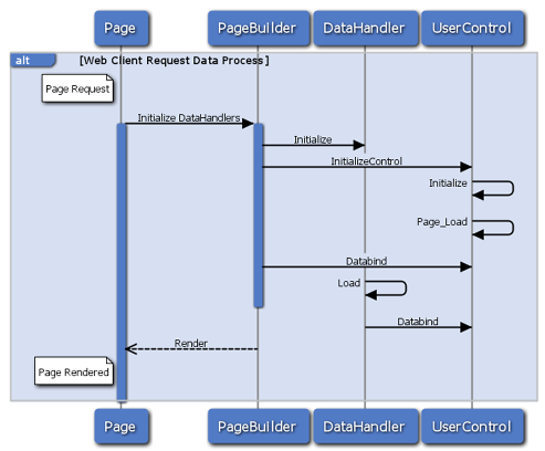
The process of initialization is shown in the figure below. It starts when a request for a page reaches the web server. The framework constructs the view by first checking the cache to see if this page has been previously created and cached. If it has not, it parses the page SOML and creates the MVC view based on the page definition. The page is then rendered to the client and cached for future requests.
Invoking a control process:
The data handler
Data handlers are defined at the top in a page definition. Data handlers are responsible for fetching the information displayed on a page when rendered, as well as persisting changes when complete.
Similar to the initialization of a control, this is an opportune time for the data handler to instantiate any types required for conducting data-handler operations.
The Initialize method signature is the same as the UserControlBase Initialize method, however, unlike the UserControlBase, the DataHandlerBase does not automatically parse the XmlNode argument. Not doing so also means that public properties with the same name are not automatically populated. Listing Four demonstrates one way to accomplish the same using code. It simply loops over all the nodes in the XmlNode and looks for the elements with the same names as the properties declared in the data handler and sets the value.
using System;
using SuperOffice.CRM.Services;
using SuperOffice.CRM.Web;
using SuperOffice.CRM.Web.Data;

namespace ControlsAndDataHandlers
{
  ///
  /// Register in ObjectMapping.config
  ///
  public class PersonalColorDataHandler : DataHandlerBase
  {
    private const string PERSONAL_COLOR      = "PersonalColorCarrier";
    private const string COLOR_LIST          = "PersonalColorList";
    private const string PERSON_CARRIER      = "PersonCarrier";
    private const string PERSON_DATA_SOURCE  = "PersonDataSourceName";
    private const string PERSON_UDF_PROG_ID  = "UDFieldProgId";
    private const string PERSON_UDF_LIST_ID  = "UDListId";
    private PersonalColorCarrier _personalColorCarrier = null;
    private PersonAgent _personAgent;
    public string PersonDataSourceName { get; set; }
    public string UDFieldProgId { get; set; }
    public string UDListId { get; set; }
    ///
    /// The PrimaryCurrent is set in the constructor.
    /// For the PersonalColorDataHandler 'person' is the primary current.
    ///
    public PersonalColorDataHandler() : base(ApplicationDefs.CurrentNames.Person)
    {
    }
    public override void Initialize(System.Xml.XmlNode config, string id)
    {
      foreach (System.Xml.XmlNode item in config.ChildNodes)
      {
        if (item.Name == PERSON_DATA_SOURCE)
          PersonDataSourceName = item.InnerText;
        elseif (item.Name == PERSON_UDF_PROG_ID)
          UDFieldProgId = item.InnerText;
        elseif (item.Name == PERSON_UDF_LIST_ID)
          UDListId = item.InnerText;
      }
      base.Initialize(config, id);
      _personAgent = new PersonAgent();
      this._dataCarriers.Add(PERSONAL_COLOR, null);
      this._dataCarriers.Add(COLOR_LIST, null);
      this._dataCarriers.Add(PERSON_CARRIER, null);
    }
    public override void Load(string CarrierId)
    {
    }
    public override void Save()
    {
    }
  }
}
Once all the data handlers for a page have completed initialization, the controls defined in that page are initialized as discussed in the previous section.
Page callbacks and postbacks
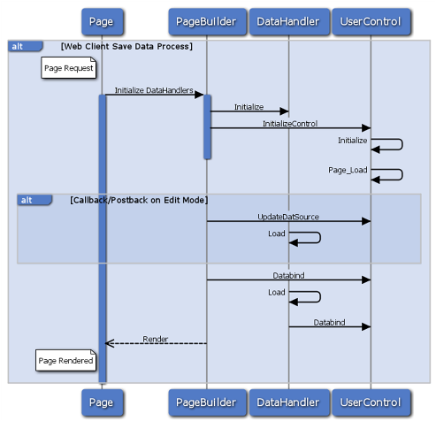
Once a page is rendered, it’s logical to assume that the information it contains is probably going to change and needs to be persisted back to a data store somehow. When that happens, the same path of code execution occurs. That is to say that the framework re-initializes the data handlers and then re-initializes the controls. This time, however, a call to the UpdateDataSource method for each control is invoked. This gives the view an opportunity to communicate any changes with the Model – the data handler, which is then responsible for persisting those changes.
Invoking a save process:
The DataCarrier
DataCarriers reside in the DataCarriers property of a data handler. The DataCarriers property is simply a collection of non-typed objects. The collection is generally used as the storage place for all data that populates the controls on a page. It may also contain additional data needed during the lifetime of a Model.
It’s quite normal for the type of a DataCarrier item to be a complex type, such as a PersonEntity or ContactEntity, and used as a data source for controls displayed in a rendered view.
So how does a DataCarrier become the data source for a control? It all starts in the SOML of a page. The following code contains the declaration for each data handler on the contact page. Each data handler has its own collection of carriers that provide information to the various controls defined on the contact page.
<page id="ContactPage">
  <data>
    <datahandlers>
      <datahandler id="NavigatorDataHandler" type="NavigatorDataHandler"></datahandler>
      <datahandler id="ContactEntityDataHandler" type="ContactEntityDataHandler"></datahandler>
      <datahandler id="PersonEntityDataHandler" type="PersonEntityDataHandler"></datahandler>
      ...
  </data>
  <panels>
    <panel reference="Menu" />
    <panel reference="ButtonBar" />
    <panel reference="Navigator" />
    <panel reference="Contact" />
  </panels>
</page>
Drilling down into the page configuration, eventually getting to the MainView View element, the code below shows the ContactMainHeaderControl declaration.ContactMainHeaderConrtol is a custom control that must map to a mapping name defined in the SoObjectMapping.config file.
What is important here is the datasource element. It defines the data source for this control. It specifies that the data source location is in the ContactEntityDataHandler.DataCarriers collection. The key used to access the DataCarrier in the collection is "ContactEntity". You can conceptually view that carrier value is accessed like a collection indexer, i.e. DataCarriers["ContactEntity"] in C#.
The contact page configuration, extracted from SoMainviewView.config:
<view id="MainView" type="SoView" soprotocol="main" current="contact">
    <caption binding="resources">[SR_COMMON_CONTACT]</caption>
    <tooltip>The main one</tooltip>
    <controlgroups>
        <controlgroup id="mainHeadergroup" type="SoControlGroup" position="absolute" top="5px" left="5px" right="20px">
            <controls>
                <control id="ContactMainHeaderControl" type="ContactHeader">
                    <datasource>ContactEntityDataHandler.ContactEntity</datasource>
                    <config></config>
                </control>
            </controls>
        </controlgroup>
    ...
    </controlgroups>
  ...
</view>
Bring it all together
It may seem that up until now I have been discussing scattered pieces of a jigsaw puzzle, but while thinking about everything mentioned up to this point and looking at the conceptual overview below, everything should be becoming much clearer.
To summarize the figure, the controller intercepts requests to the web server, which then invokes the PageBuilder framework to construct a view or page. DataHandlers then became initialized and ready to fetch data. Next, the page, and the controls on that page, become initialized, loaded, and data binding occurs. At this point, for each control with a defined data source, a corresponding data handler DataCarriers collection is populated and expected to contain the control data source. Lastly, when data binding operations are complete, the page is rendered.
The DataDispatcher class is useful for bridging the data-access gap between the view and the model. Although used in many circumstances, the most popular use of the DataDispatcher class is when a custom control has a defined data source but needs additional data tucked away in another data carrier in the DataCarriers collection. For instance, consider the well-defined data source for the ContactMainHeaderControl in the above code. What is the view to do when it needs information not stored in that data source, but another carrier stored in the same collection? This is where the DataDispatcher is useful. It has the capabilities to get any one of the carriers stored in the collection, as well as other useful methods for checking data-rights.
Conceptual overview, emphasizing model and view:
Custom controls
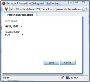
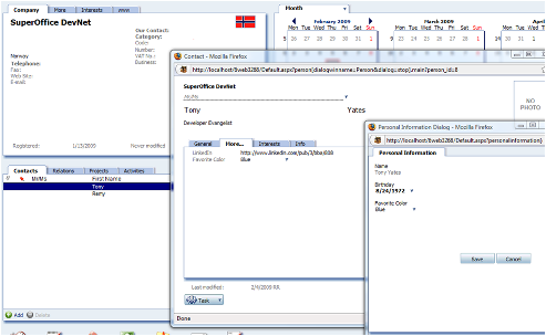
Displayed in Figure Seven is a simple dialog containing some personal information; the birthday, name, and favorite color of a person.
This may at first appear to be a trivial task, hardly worth using to demonstrate the application design and data-binding routine, but I’m confident that by the end of this section you will agree that simplicity here was best to fully examine the underlying design principles, data-flow, and constructs.
A custom dialog containing custom control with personal information:
Creating a new list in SoAdmin is a very simple task. It’s as easy as clicking on the Lists button and then clicking Add to create a new list. For this example, I called the new list "Favorite Color". For the sake of this demonstration, the list name is actually insignificant. What is important is the list id for the Favorite Color list. The ID is stored in the udlistdefinition table of the database and is used by the APIs when accessing list values.
User-defined list Favorite Color:
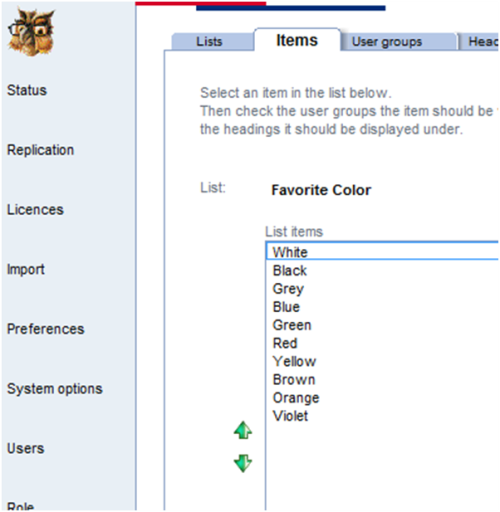
The idea of a favorite color really only applies to a person. So, I’ve opted to keep it simple and create a user-defined list in SoAdmin (see above), and then create a user-defined field on the contact (person) entity that displays a selected item from that list. The next figure displays the More tab in the person dialog, showing the user-defined field, as well as the Personal Information dialog.
Personal Information dialog with data about the person:
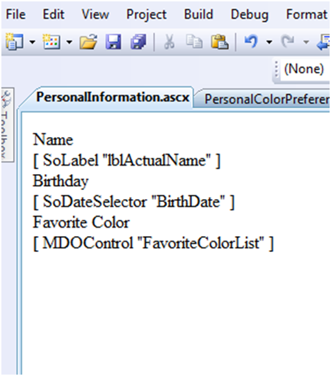
As seen below, the user control is very simple. It consists of three labels and three built-in controls. There is one SoLabel to hold the current person's name, one SoDateSelector to display the current person's birthday, and one SoMDOControl control to display the favorite color for the current person.
PersonInformation usercontrol in Visual Studio:
The markup for the user control is shown in the code below. Although it may not be obvious, some SuperOffice control properties are different than their ASPX counterparts. Take the SoLabel and asp:Label control for example. Text displayed in an asp:Label control is accomplished by setting the Text property, whereas the SoLabel control instead uses a property called Caption.
The markup for the PersonalInformation.ascx usercontrol:
<%@ Control Language="C#" AutoEventWireup="true" CodeBehind="PersonalInformation.ascx.cs" Inherits="ControlsAndDataHandlers.PersonalInformation"%>
<%@RegisterTagPrefix="so2" Namespace="SuperOffice.CRM.Web.UI.Controls" Assembly="SuperOffice.CRMWeb"%>
<asp:LabelID="lblName" runat="server" Text="Name"></asp:Label>
<br/>
<so2:SoLabelID="lblActualName" runat="server" Caption="FullName"/>
<br/>
<asp:LabelID="lblBirthDate" runat="server" Text="Birthday"></asp:Label>
<br/>
<so2:SoDateSelectorID="BirthDate" runat="server" Width="70px" ContextStyle="Important"/>
<br/>
<asp:LabelID="lblFavoriteColor" runat="server" Text="Favorite Color"></asp:Label>
<br/>
<so2:MDOControlID="FavoriteColorList" ShowIcons="false" Width="50%" Mode="Normal" OnlyHistoryWithEmptySearch="false" searchable="false" runat="server"/>
The code file for the PersonalInformation.ascx control is defined below. The first thing to pay attention to is the base class, UserControlBase. In general ASP.NET development, there are two types of custom controls, user controls, and web controls. For this example, we are building a usercontol, and therefore inherit from UserControlBase. The base class to use when creating a custom control of the web control variety is the SuperOffice.CRM.Web.UI.Controls.ControlBase. Classes that inherit from these will gain support for AJAX callbacks, declarative configuration, and layout assistance from the framework.
Code behind for PersonalInformation.ascx file:
using System;
using SuperOffice.Data;
using SuperOffice.CRM.Web;
namespace ControlsAndDataHandlers
{
  public partial class PersonalInformation : SuperOffice.CRM.Web.UI.Controls.UserControlBase
  {
    public string PersonDataSourceName { get; set; }
    public string UDFieldProgId { get; set; }
    public string UDListId { get; set; }
    protected void Page_Load(object sender, EventArgs e)
    {
    }
    public override void Initialize(System.Xml.XmlNode config, string id)
    {
      base.Initialize(config, id);
      Setup();
    }
    private void Setup()
    {
      FavoriteColorList.EditMode = true;
      FavoriteColorList.ListName = "udlist" + UDListId;
      FavoriteColorList.DataSourceName = PersonDataSourceName + ".UserDefinedFields." + UDFieldProgId;
      FavoriteColorList.DisplayTextDataSource = PersonDataSourceName + ".UserDefinedFields." + UDFieldProgId + ":DisplayText";
      BirthDate.ReadOnly = false;
      BirthDate.EditMode = true;
      BirthDate.DataSourceName = this.DataSourceName + ".BirthDate";
      BirthDate.FieldRight = DataDispatcherManager.GetDataDispatcher().GetFieldRight(this.DataSourceName + ".BirthDate");
    }
    public override void DataBind()
    {
      PersonalColorCarrier colorCarrier = (PersonalColorCarrier)this.DataSource;
      if (colorCarrier != null)
      {
        this.lblActualName.Text = colorCarrier.Name;
      }
      FavoriteColorList.DataBind();
      BirthDate.DataSource = SuperOffice.Globalization.ResourceManager.ConvertToShortDateString(colorCarrier.BirthDate);
      BirthDate.DataBind();
    }
    public override void UpdateDataSource()
    {
      FavoriteColorList.UpdateDataSource();
      BirthDate.UpdateDataSource();
    }
  }
}
The sequence of events for this class when rendered is as follows: Initialize, Page_Load and then DataBind. Once initialization is complete in the base, which if you recall populates the properties with values defined in the SOML, it is a good time to hook up the data bind logic. The Setup method contains all the code necessary to hookup the MDO control and SoDateSelector controls. The control values are then assigned and populated in the DataBind method.
If any of the control's values have changed, those changes have the opportunity to update their data source in the UpdateDataSource method. SuperOffice controls, with the correct data binding set, will automatically update their data source by calling the controls UpdateDataSource method. For non-SuperOffice controls, it is up to the developer to update the data source directly. For example:
((PersonalColorCarrier)this.DataSource).BirthDate = BirthDate.Value;
Building the Page
The SOML below defines the PersonalInformation page. This content is found in the SoPersonalInformation.config file.
Beyond the page id and title, you will see the datahandlers element. This is where all models are made available as datahandlers, and contain the functionality necessary to host the data source for each control on the page. As mentioned in the Data Sources and Configuration Settings section, the config child element contains elements that will be passed into the datahandlers’ Initialize method. Below, I am are declaring three elements; a string path to a datacarrier that will contain a PersonEntity instance, the progid for the user-defined field list – Favorite Color, and the list id for the Favorite Color list. Soon, I’ll show you how these elements are used in the datahandler.
Partial contents of the SoPersonalInformation.config file:
<page id="PersonalInformationDialog">
  <title>Personal Information Dialog</title>
  <data>
    <datahandlers>
      <datahandler id="PersonalColorDataHandler"type="PersonalColorDataHandler">
        <config>
          <PersonDataSourceName>PersonalColorDataHandler.PersonCarrier</PersonDataSourceName>
          <UDFieldProgId>SuperOffice:2</UDFieldProgId>
          <UDListId>31</UDListId>
        </config>
      </datahandler>
    </datahandlers>
  </data>
  <panels>
    <panel id="MainPanel" type="SoDialogPanel" soprotocol="personalcolor" paneltype="Main" placeholderid="MainPlaceHolder" >
      <cards>
        <card id="PersonColorDialogCard" type="SoTabbedCard" placeholderid="DialogCardPlaceHolder" cardtype="MainCard" >
          <views>
            <view id="PersonalColorExampleControl" type="SoDialogView" soprotocol="main">
              <caption>Personal Information</caption>
              <controlgroups>
                <controlgroup id="DateControlsControlGroup" type="SoControlGroup" top="10px" height="100%" width="100%" left="10px" right="0px" position="absolute">
                  <controls>
                    <control id="PersonalColorControl" type="PersonalInfoUserControl" width="100%" top="0px" left="0px" height="100%" position="absolute" >
                      <datasource>PersonalColorDataHandler.PersonalColorCarrier</datasource>
                        <config>
                          <PersonDataSourceName>PersonalColorDataHandler.PersonCarrier</PersonDataSourceName>
                          <UDFieldProgId>SuperOffice:2</UDFieldProgId>
                          <UDListId>31</UDListId>
                        </config>
                    </control>
                  </controls>
                </controlgroup>
              </controlgroups>
            </view>
          </views>
          <config>
            <tabbedviews>
              <viewref>PersonalColorExampleControl</viewref>
            </tabbedviews>
            <only-visible-views>true</only-visible-views>
            <datahandlers-to-save>
              <datahandler-reference>PersonalColorDataHandler</datahandler-reference>
            </datahandlers-to-save>
          </config>
        </card>
      </cards>
      <config>
      </config>
    </panel>
  </panels>
</page>
Drilling into the SOML, focus on the only control declared on the page. The control id is PersonalColorControl and the type is PersonalInfoUserControl. The control id must be unique, different from any other control id declared on the page. The type value must match a MappingName attribute declared for an object element of type UserControl in SoObjectMapping.config. There was an example of this earlier in the Defining Controls section.
In order for a view element to be rendered in a card of type SoTabbedCard, it must be referenced in the tabbedviews element of the card config section.
When a save request gets posted from a particular card, how does the card know which datahandlers’ Save method to invoke? The framework again uses the cards config section and looks at the datahandlers-to-save element. Although the element name is plural, there can only be one datahandler-reference child element defined. There is also a datahandlers-to-delete element to manage delete operations, but this example does not make use of that.
Building the DataHandler
Below, Listing Ten contains the datahandler source code. It declared a few constant variables that contain a value equal to the element names defined in the datahandlers section of Listing Nine. As stated earlier, the datahandler base class does not as of this writing support populating properties with the values defined in elements from the config section with the same name. Therefore, it is done explicitly in this datahandlers Initialize method.
Two other members of interest are the PersonColorCarrier and PersonAgent types. The PersonColorCarrier type is the class that will hold the personal information about the current person, while the PersonAgent is used to fetch that information.
The constructor calls into the base and specifies that this datahandlers PrimaryCurrent property is to contain the keyword that represents the current person, which is "person". This is not necessary but used rather as a convenience. It is used here to look up the current person id in the Load method.
Listing Ten: PersonalColorDataHandler source code.
Warning
It looks like the sample you are looking for does not exist.
The most common scenario involving a datahandler is leveraging it as a data source container. The last three lines in the initialize method are dedicated to preparing the DataCarriers collection by populating it with keys, or carrier names, that will later be used to store data. DataCarriers are normally populated in the Load method when the carrier name is equal to the CarrierId argument.
The Load method is invoked when a control attempts to retrieve the datasource and get or set the value the datasource contains. In the sample code, when the DataBind method in the PersonalInformation user control is called, one of the first things to occur is that the controls data source is cast to the type it contains, a PersonalColorCarrier instance. The moment the DataSource property is accessed, the datahandler Load method is invoked and used to populate the requested DataCarrier with current data.
Building the carrier
Carriers are data containers - nothing more, nothing less. The following code shows the PersonalColorCarrier type. The sole purpose of this class is to demonstrate how you can construct complex types that contain data, and become the data source for controls defined on a page.
The PersonalColorCarrier source code:
using System;

namespace ControlsAndDataHandlers
{
  public class PersonalColorCarrier
  {
    private BasicColor _color;
    private string _name;
    public string Name
    {
      get { return _name; }
      set { _name = value; }
    }
    public BasicColor SelectedColor
    {
      get { return _color; }
      set { _color = value; }
    }
    private DateTime _date;
    public DateTime BirthDate
    {
      get { return _date; }
      set { _date = value; }
    }
  }
  public enum BasicColor
  {
    //These numbers match the field values
    //in the UDLIST table of the SO database
    White = 1,
    Black,
    Grey,
    Blue,
    Green,
    Red,
    Yellow,
    Brown,
    Orange,
    Violet
  }
}
There is nothing complicated about the PeronalColorCarrier class. The key here is to look back at the PersonalColorDataHandler source code and see how this class instance is populated and added to the DataCarriers collection. Then look and see how it is referenced in the SOML page – in the control datasource element.
It would probably have been cleaner and simpler to only use the PersonEntity class for all data sources for the controls on the user control. However, at least now you have some idea about how flexible the framework is, and how easy it can be to incorporate your own data into controls defined on a page.
Summary
In this article, I have presented a conceptual overview of how the SuperOffice web client application architecture is loosely based on the Model-View-Controller pattern. I have walked through and demonstrated with snippets each concept and showed how the pieces fit together. You should now have a general understanding of what parts make up the different pieces of MVC, how they are connected, and communicate to share information.
Download the sample code and test it out for yourself!