App Store Partner logo and brand guidelines
As a certified SuperOffice App Store Partner, you are authorized to use the official SuperOffice App Store Partner logo to communicate your partnership status. These guidelines help you use the logo, brand colors, images, and tone of voice consistently, so your communications stay clear, accessible, and on brand.
Note
The words App Store Partner must remain in English and must not be translated. All surrounding copy may be localized where relevant.
App Store listing image guidelines
Use the following specifications for images in your App Store listing:
- Images, such as UI screenshots: Must be in a 16:9 aspect ratio, with dimensions between 1920x1080 and 3840x2160 pixels.
- Company profile image (placed inside a bubble): Upload a square image (1080x1080 pixels).
We have Canva templates available for making the company profile image with bubble, and for making images with the correct background and text:
App Store Partner logo
The App Store Partner logo is a trust mark that confirms an official partnership with SuperOffice.
You may use the logo in:
- Website footers and partner pages
- App Store listings
- Product landing pages
- Social media announcements
- Presentations and sales materials
- Campaigns and co-marketing activities
- Event and webinar promotions
Use the specific SuperOffice App Store Partner logos in brand colors (SuperOffice green, Dune white, and Charcoal black). When using partnership logos, follow the provided templates and keep the words App Store Partner unchanged if translating text.
Approved logo assets
Always use the official logo files provided by SuperOffice. Do not recreate, redraw, or modify the logo — custom attempts are not certifiable.
The asset package includes:
- Standard App Store Partner logo
- Inverted App Store Partner logo
- Logo variations in approved brand colors
- PNG and SVG formats
- Social media assets
- Canva templates
Download the App Store Partner brand guide and logos
Brand colors
The App Store Partner logo is available in the official SuperOffice brand colors. These colors are optimized for accessibility and readability.
| Color | HEX |
|---|---|
| SuperOffice Green | #06423e |
| Charcoal Black | #1c1c1e |
| Dune White | #f2efea |
Logo positioning
The logo works best when it has space to stand out. Always place the SuperOffice logo on a clear background and give it room to breathe. At minimum, leave space around it equal to the Hugo symbol.
Logo usage
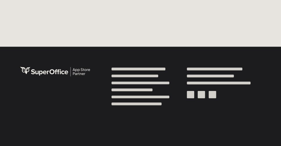
Always use the standard logo on light backgrounds and the inverted version on dark backgrounds to ensure contrast and readability. Only use the provided logo files and treat them according to the SuperOffice logo guidelines.
Accessibility standards
All partner communications should aim to meet:
- WCAG AA minimum standards
- AAA standards where possible
This is especially important for:
- Body copy
- Interfaces
- Buttons
- Social media graphics
- Website content
Ensure strong contrast between text and background colors.
Placement examples
Recommended placements:
- Website footer: Use the App Store Partner logo in your website footer or dedicated partner section.
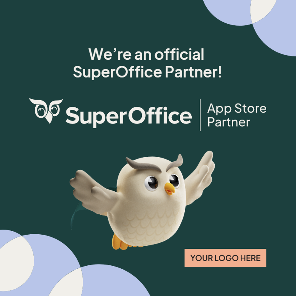
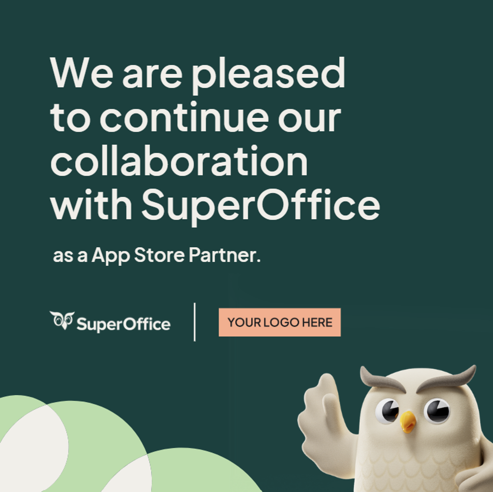
- Social media: Use the logo in partnership announcements, milestone celebrations, and co-marketing campaigns.
- App listings: Use the logo in your SuperOffice App Store listing and integration landing pages.
- Presentations and sales material: Include the logo when presenting certified integrations or official partnerships.

Tone of voice
When describing SuperOffice or its products, use the approved texts and terminology to maintain consistency. The tone is human, simple, and boldly knowledgeable, reflecting the brand's personality.
Our tone is:
- Human
- Helpful
- Clear
- Confident
- Boldly knowledgeable
Writing guidelines
- Keep communication simple. Avoid unnecessary technical jargon.
- Focus on customer value. Explain how integrations and solutions help customers work smarter and build stronger relationships.
- Use approved terminology. Use official product names and partnership terminology, and avoid creating unofficial naming conventions. Examples:
- "SuperOffice App Store Partner"
- "Official SuperOffice integration"
- "Certified App Store Partner"
Note
The words App Store Partner must remain in English and should not be translated. All surrounding copy may be localized where relevant.
Typography
SuperOffice uses the custom typeface SuperOffice Sans, which reflects the SuperOffice brand personality: human, simple, confident, and modern.
Partners are not expected to use SuperOffice Sans in their own environments unless using official SuperOffice templates. When creating your own supporting materials, use clean and modern typography that complements the SuperOffice visual identity. When referencing SuperOffice, its products, or the partnership, maintain a professional and consistent tone.
Brand narrative
SuperOffice helps companies build strong customer relationships through intuitive CRM solutions that are easy to use, practical, and designed for real business needs. Partners play an important role in extending the value of the SuperOffice ecosystem through integrations, expertise, and complementary services.
When communicating about the partnership:
- Emphasize customer value
- Focus on collaboration and innovation
- Keep messaging clear and practical
- Align with the SuperOffice customer-first mindset
Best practices checklist
Before publishing any partner communication, verify the following:
- Correct logo version used
- Sufficient clear space around the logo
- No logo distortion or edits
- Approved colors only
- Accessible contrast levels
- Correct partner terminology
- Professional and consistent tone
- Up-to-date assets used
Support and questions
If you have questions about logo usage, templates, or co-marketing activities, please contact your SuperOffice partner representative.
Always request approval before creating:
- New co-branded campaigns
- Custom logo adaptations
- Joint press releases
- Event branding concepts
We take partnerships personally. Thank you for being part of the SuperOffice ecosystem and helping customers create stronger relationships every day.